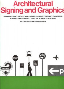
The following appeared in volume 2, number 1, of “Dimension,” the design journal of SEGD (Society for Environmental Graphic Design) in tribute to the late Los Angeles graphic designer, John Follis.
In my estimation, the value of an Art Center College of Design education derives not from the pedantry typical of the school’s career educators, but rather from the working professionals that take precious time (I see now) away from their invariably busy schedules to show very green students “how it’s done” in the real world. One such professional was John Follis. While many of my “theoretical” school projects thrived in the hothouse of a student portfolio impervious to real world dynamics, John showed me what it was really like out there: testy clients, impractical budgets, impossible deadlines. John showed me that, despite all this, great work can be done, if one digs beyond the obvious, searches for another, better way, and questions, questions, questions. In this spirit, John would often, in the middle of a critique, fire out of the blue to one of us, “What, after all, is a sign?”

The question is still provocative, over forty years later. The usual dictionary definition, sandwiched between ‘sigmoid’ on the north and ‘signal’ on the south, goes something like this: “An inscribed board, space, etc., serving for information, advertisement, etc., on a building, along a street, or the like.” Another, less prosaic definition, the classic environmental design maxim by Charles S. Pierce, states: “A sign is something by knowing which we know something more.”
We seem to have always had signs, even way before Homo sapiens learned to grunt intelligible sounds to one another. And what a sign is, or isn’t, has changed with the times. Long ago, we found comfort in the marks left on trees left by travelers before us, the trade wind that blew sure to the lee, the stars that fixed the course. In the last century, a traveler would identify the town as being at the fork in the river, the mayor’s house by its twin-trunk elm. The way was pure and simple; Nature, the steadfast companion. Today, sadly, things aren’t quite so uncomplicated: the mere objective of finding a restroom in an unfamiliar building can be, perversely, impossible. ‘Nature calls,’ but it no longer serves.
The sweeping vistas and beaten paths of less equivocal times have given rise to office cubicles and featureless corridors. The natural signals for getting from place to place to which we were long accustomed, today, are either impractical or simply no longer exist.
Once upon a time, the traveler pointed to the distant peak and, after three day’s hard march, could look back from whence he came, warmed by the majesty of the obvious accomplishment. Today, we cannot see where we have come from. Worse, we cannot see where we’re going. Mean walls and brutish angles stand in our paths blocking our views. We are fixed in limbo, between one-dimensional horizons of go and return. In short, our worlds have become small, confined; our ability to naturally get from point ‘A’ to point ‘B’ impeded, impaired. Modern wayfaring is less the forward, self-sufficient enterprise of old than it is an occasion for shielding, sifting, reacting to some other modern mortal’s usually fallible idea as to how to “show the way.”

Millions of signs. Billions of signs. The typical urban environment is visually chaotic. As we stumble along, verbal and graphic information shouts, intrudes. Petty and contradictory messages serve merely to cancel one another and the combined messaging conflates between one’s ears into information overload. Which way to turn? The wayfarer needs help.
It is, then, the responsibility of environmental graphic designers to show the way: down a path blazed originally by Peter Behrens and Adriano Olivetti and, during the past fifty years, by Paul Rand, Otil Aicher, Saul Bass and John Follis. At all costs, the path must move forward, even as the jungle grows denser. We must each take our hacks.
Leave a Reply